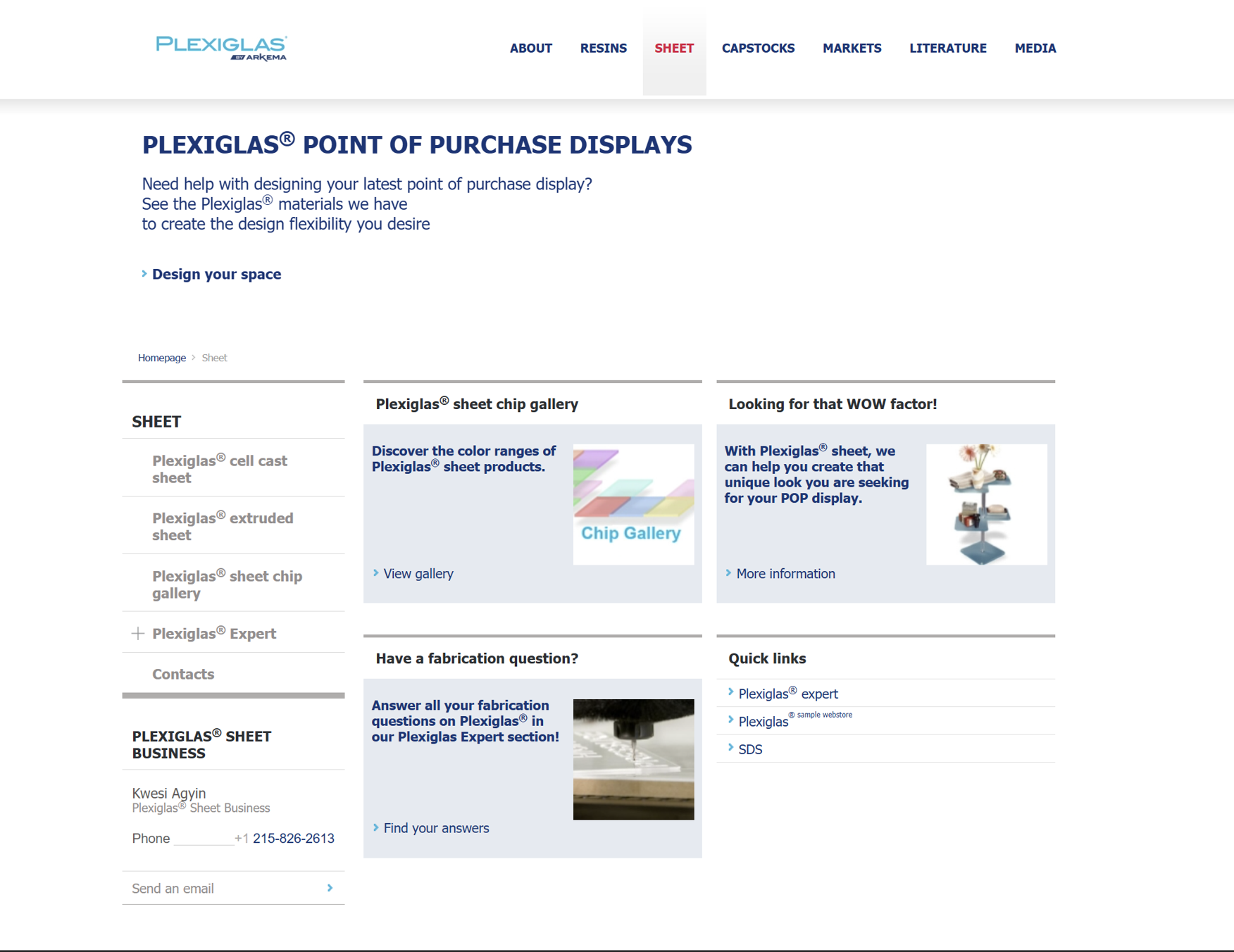
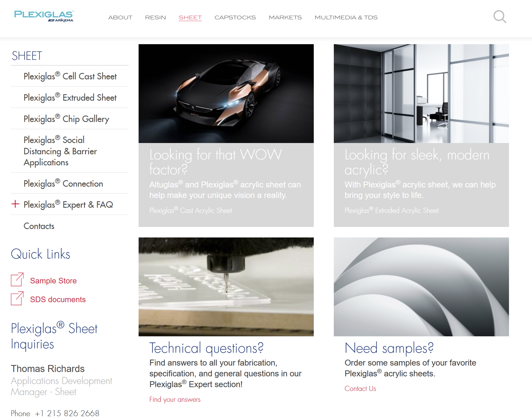
When I joined the Plexiglas® marketing team, the website was long overdue for a refresh. It was cluttered with broken links, outdated contact information, incomplete pages, typos, and low-quality images, making it difficult for users to navigate or trust the content. Additionally, and perhaps most surprising, was that when searching for this popular name-brand, the company didn’t show up until page three on Google and page five on Safari.
I redesigned, restructured, and rewrote the entire website, transforming it into a modern, user-friendly experience that viewers could trust. I’ve included an interactive before and after photo below to showcase the homepage changes, with far more improvements done throughout the rest of the site and behind the scenes, including:
—⸎ Fixed all broken links
—⸎ Updated all contact information and territory maps
—⸎ Rewrote and edited all content for clarity, accuracy, and tone
—⸎ Replaced outdated, low-res photos with modern, high-res, brand aligned photography
—⸎ Created new landing pages and child pages to improve the site’s flow and navigation, and to promote products and events as necessary
—⸎ Removed unnecessary and obsolete information
—⸎ Restructured the navigation and layout throughout the site for a smoother, more intuitive experience
—⸎ Applied consistent brand styling and formatting throughout for a more consistent feel
The result of all this hard work was a significantly improved user experience, a stronger brand presence, and a platform that was finally reflective of the quality of the Plexiglas® brand name. Most importantly, it got the website back as a top result on page one for both Google and Safari searches.